
Commissioned and Sponsored projects
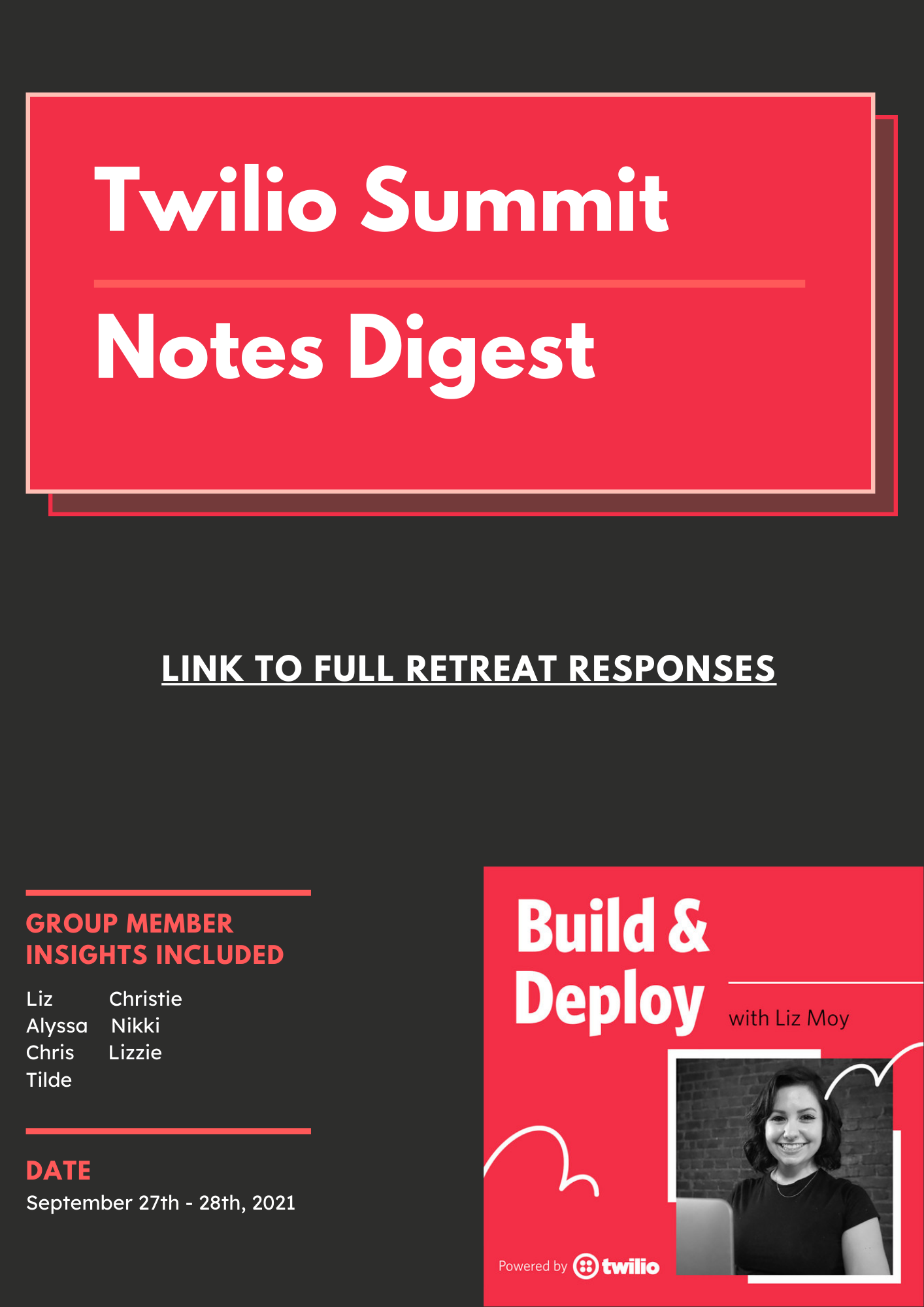
*Twilio Summit Recap* As the first deliverable in a multi-quarter client project with phase-dependent stakeholders, this Notes Digest from the kick-off summit would serve as the universal creed for all future decision-making points. With that in mind, I identified personal shout-outs as an effective tool for nonlinear team-building. As new team members joined and old team members became confused about who was responsible and accountable for the current state of the project, I established the first page as an engaging source-of-truth bulletin board that could be quickly and continually updated with minimal time and energy requirements.
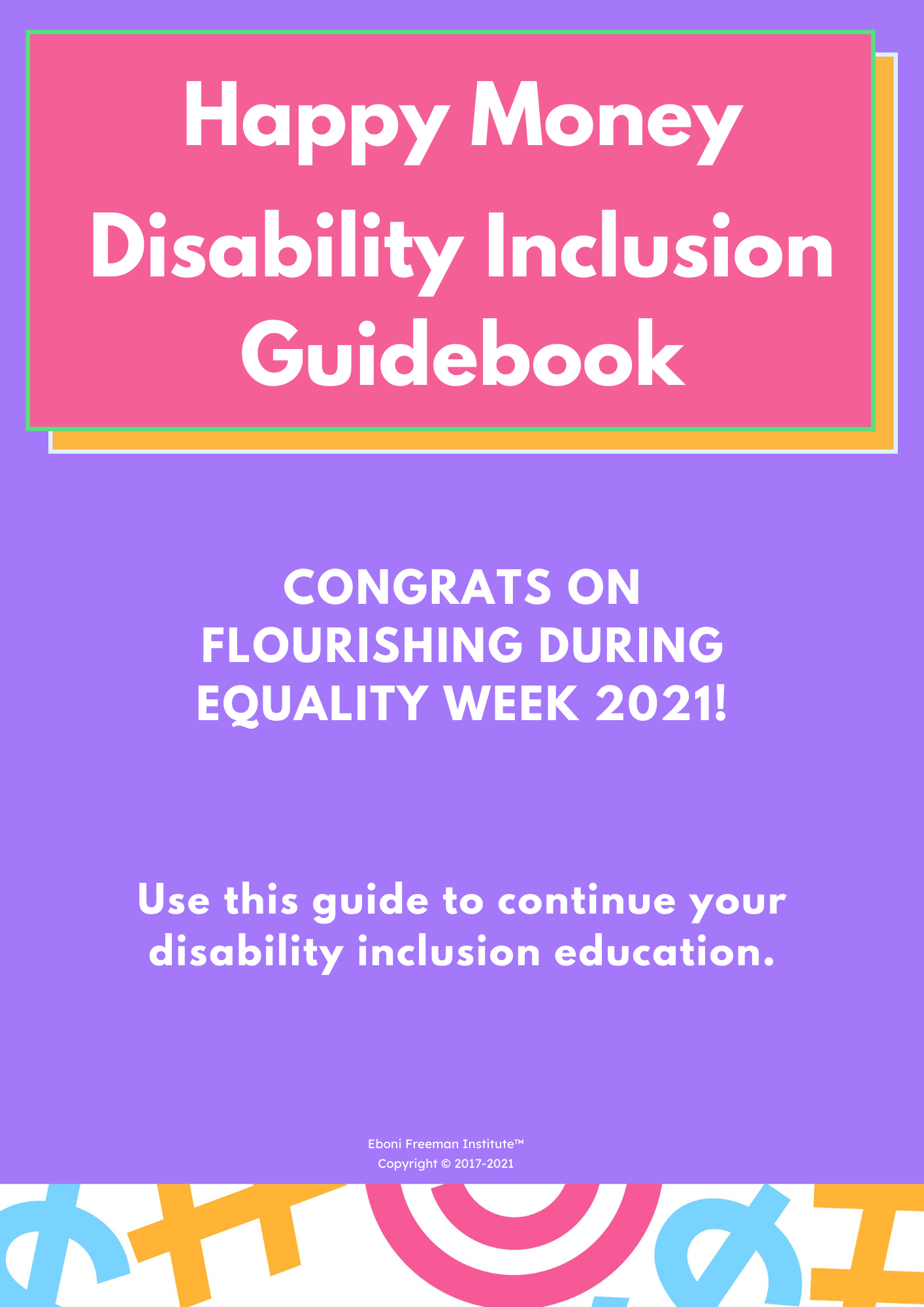
*Happy Money Inc Disability Inclusion Guidebook* For this client work, I crafted a post-workshop guidebook for disability inclusion seminar attendees to continue their learning in the short-term and refresh their knowledge over the longterm. I used the client's brand colors to provide a visual tie between myself and their established style. As an outside consultant educating employees on a topic that had not yet been discussed extensively internally, I knew it was critical to provide a visual cue that I understood and valued their established culture. Additionally, by approximating their typography, I communicated that I was there to meet them where they were by using the language of their past to help them write a brighter future.

*Ability Enabled Product UI Mock-ups* After analyzing data from 175 customer discovery interviews, my startup team and I noted the continuous use of terms like "difficult" and "time-consuming" when our HR and Chief Diversity Officer interviewees described the hurdles they faced while searching for and using solutions to the problem of managing employee accommodations requests. Through the liberal use of negative space through large button margin areas and expanded font spacing, our product design aimed to communicate the ease, simplicity, and user-friendliness of our product. Additionally, the use of button borders helped balance simplicity with readability and click-ability.

*Pow(h)er Event Flyer* This flyer was created for the Colorado Women's Chamber of Commerce's flagship fall event. Inspired by the quote "history is written by the victors” by Winston Churchill, the bolded word 'pow(h)er' towers beside all other content on the page to illustrate that the focal point of the event is empowerment. By placing an H in parenthesis within the word power, I conveyed that the event was focused on women specifically. Additionally, the figures rising from the flyer's edges represent the event's panelists: women who have already risen to power and are willing to lead the way for those interested in following a similar path.
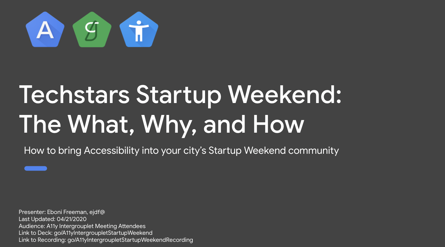
*Techstars Startup Weekend: The What, Why, and How* Created for entrepreneurial Googlers interested in leading hackathons in their cities of residence, I chose to focus my workshop on how to implement an accessibility theme. In order to begin teaching before talking, I focused on creating a high-contrast background featuring a black background and white text because it is a simple way to increase readability for low-vision viewers according to my best practices research using insights from the Low Vision Accessibility Task Force (LVTF) which is a Task Force of the Web Content Accessibility Guidelines Working Group (WCAG WG), a part of World Wide Web Consortium (W3C). With accessibility in mind, I also created a mirror presentation with black text and a white background to ensure viewers who live with astigmatism and/or “halation” receive an equitable experience.

*AI2 - Product Pitch Deck* Out of a library with 10,000+ potential icons, I selected diverse, active graphic personas for this pitch deck to represent how our diverse total addressable market can use the AI2 product to amplify their day-to-day accomplishments. Furthermore, by featuring imagery with complementary graphics that share a triadic color scheme, I established a baseline style for the remainder of the product marketing materials.

Google Analytics 1-Pager for User Onboarding
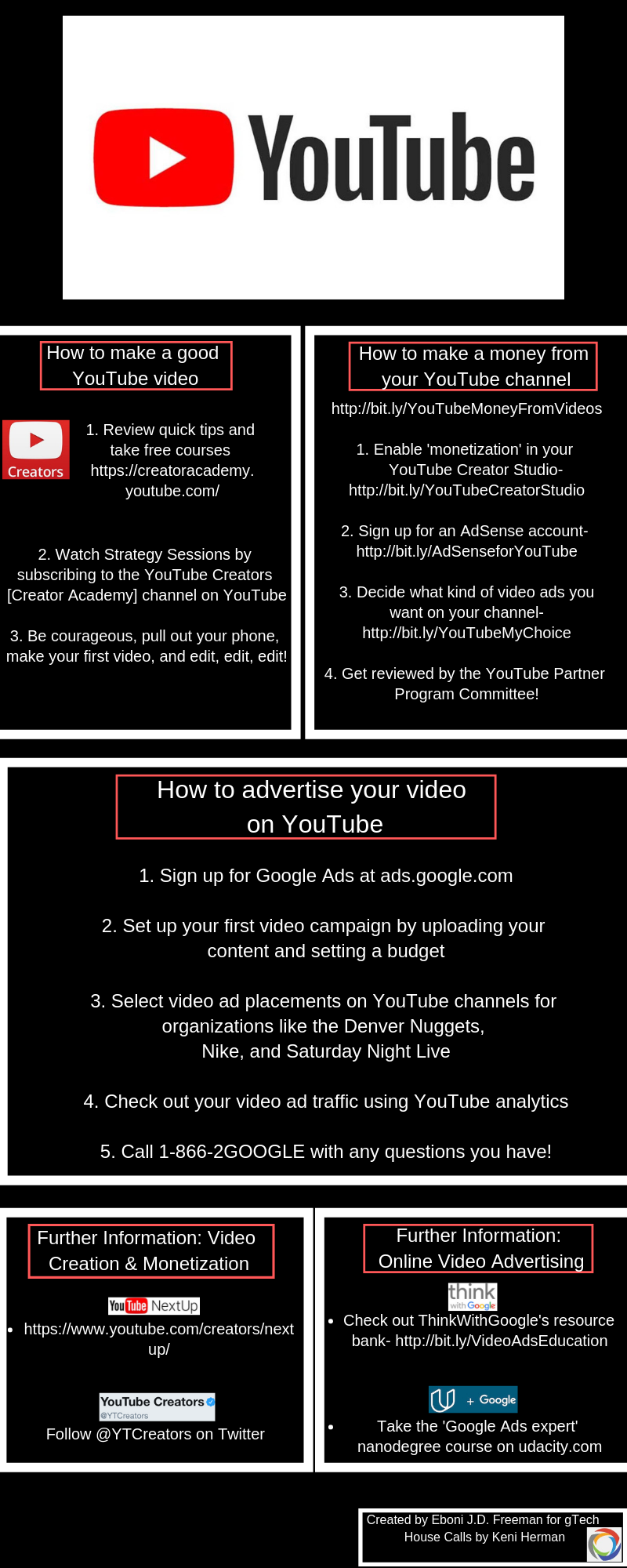
YouTube Ads 1-Pager for User Onboarding

Research & Development experiments
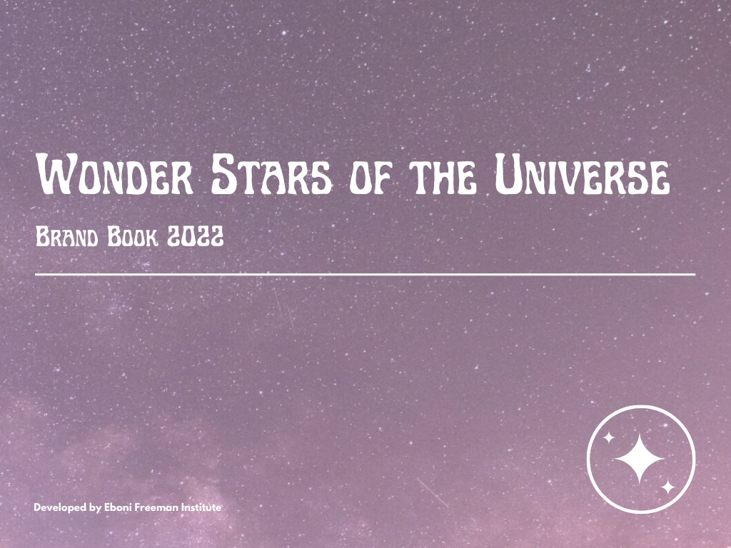
*Wonder Stars of the Universe brand book* For this personal project, I outlined the color palette, typography, logo variations, and applications for Wonder Stars of the Universe brand assets.

*Wonder Stars of the Universe Newsletter* My personal product brand - Wonder Stars of the Universe - utilizes a style guide that connotes well-organized whimsy and professional playfulness. With brand assets featuring a primary tone of dusty pink, secondary tones of shaded blacks complemented by sharp edges, my logo and typeface convey the delight I find in and the acute insights I bring to my projects.
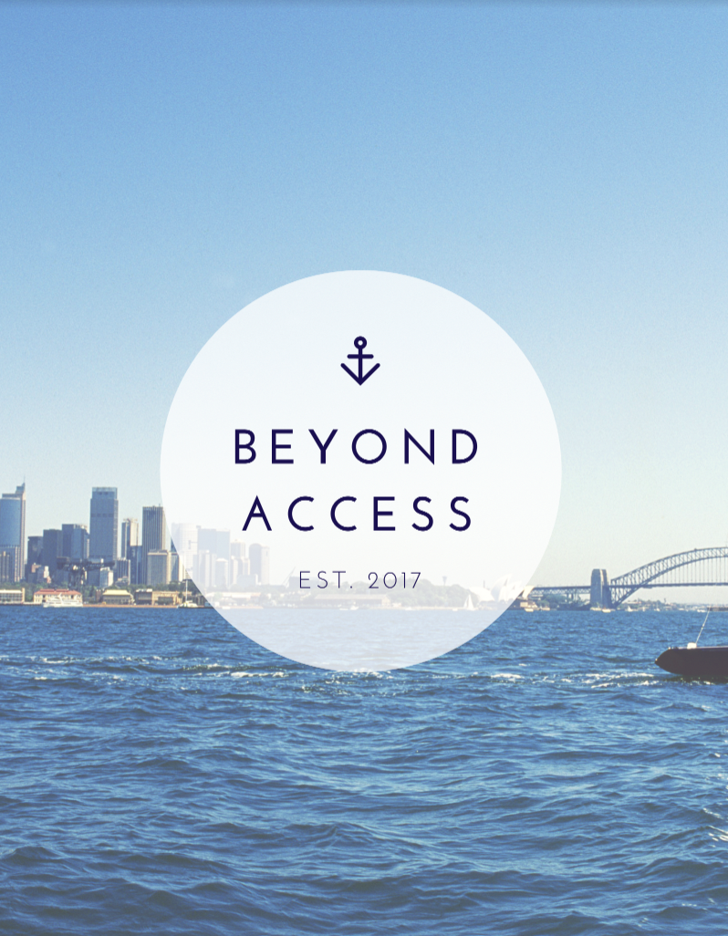
*Ability Enabled's Guide to Workplace Disability Inclusion* My collaborators and I chose a nautical theme to represent the rough waters of accessibility. From the choppy waves of bias to sweeping tsunamis of miscommunication, it can be easier for allies to stay shoreside rather than wading into the unknown. The building skyline in the background represents the status quo with no room to grow, whereas the open ocean in the foreground exemplifies the opportunity to think bigger than the land you are leaving behind.

*Ability Enabled Product Commercial8 When directing the motion graphics designer contracted to create this informational advertisement, I encouraged heavy saturation in order to visually articulate the vibrancy of the brand identity we were cultivating.
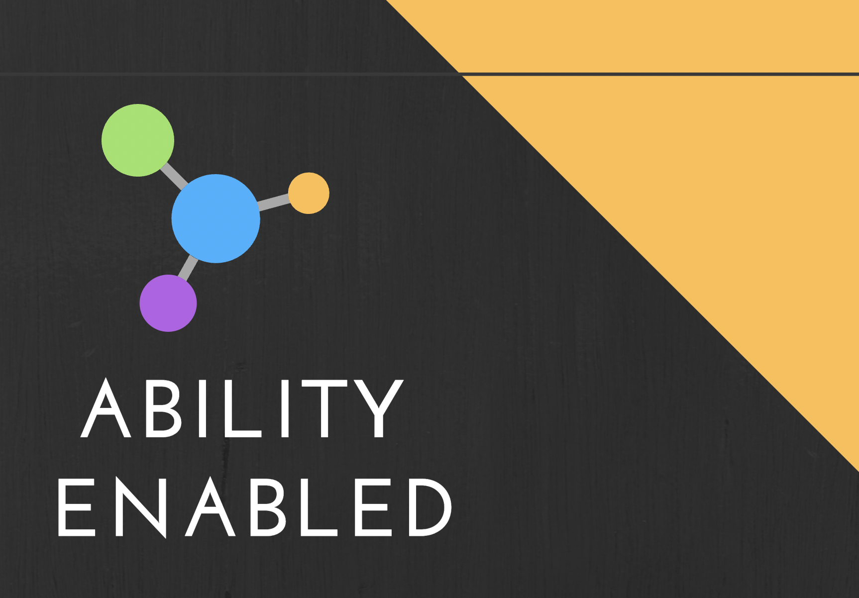
*Ability Enabled Investor Pitch Deck* The vision board for Ability Enabled's logo and pitch deck were inspired by contemporary DEI consultant designs remixed with attention on the scientific process behind our product development. Moreover, by using bonded atoms, we were able to represent the improved connection between companies and employees with disabilities who feel left outside of the business "bubble."

*Ability Enabled Product UI Mock-ups* After analyzing data from 175 customer discovery interviews, my startup team and I noted the continuous use of terms like "difficult" and "time-consuming" when our HR and Chief Diversity Officer interviewees described the hurdles they faced while searching for and using solutions to the problem of managing employee accommodations requests. Through the liberal use of negative space through large button margin areas and expanded font spacing, our product design aimed to communicate the ease, simplicity, and user-friendliness of our product. Additionally, the use of button borders helped balance simplicity with readability and click-ability.

*Street Wise Arts Artist-in-Residency + Workshop Recap* When creating community event recaps for sponsors, I prioritize story cohesion through the practice of using complementary elements. By selecting images and quotes that effectively describe the emotional arc of event participants from their first hello to the last goodbye, my viewers can comprehend the visual, audio, and tactile experience enjoyed by event participants.

*Lies, Dam* Lies, and Statistics: The Truth Behind Starting Up Your First Business* By emphasizing the symbol for femininity on top of the letter C in the Colorado flag, I aimed to inspire the audience - entrepreneurially-minded women and girls from the MidWest - to question how their gender functions as part of the larger tapestry of their geographic identity. The black leading lines of the symbol contrast the flag's warm color scheme to direct the viewer's attention to find themselves at the center of the conversation on how 'lies, dam* lies, and statistics' have impacted their life.
